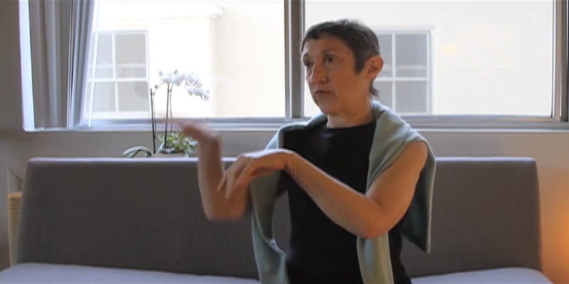
In this fourth segment of the ten part mini-video series in which Nancy Sharon Collins, stationer extraordinaire, talks about engraved stationery…Collins says that not many typographers know about engraving. Little wonder this is so because engraving isn’t in the canon of typography. Mrs. Collins likes to change all that and share what engraved letterforms are all about. Take a look in the Gallery for some clues.
In 2011 Intellect books published Mrs. Collins’ Engraver, communicator of content. This is one of those scholarly articles, the kind that professors write and read so it is thick with historic information and postulates shifts in the way we think about historic information.
Here’s the abstract, so called in academia, or brief description:
“In the hierarchy of the international typographic canon, engraved lettering has not received the acknowledgement it deserves. This article amends the international typographic canon to include the engraved letter through demonstrating how engraved lettering has significantly influenced the evolution of typographic form. By examining four historical specimens of engraved printing, the author explains how engravers utilized materials and craft-oriented opportunities to deliver content that current trends in typography have all but forgotten. Four important works of engraved lettering will be discussed: Het Groote Tafereel der Dwaasheid/The Great Mirror of Folly (1720?), A New Book of Cyphers (1726), George Bickham’s The Museum of Arts: or, The Curious Repository (1745?) and The Lincoln Crest & Monogram Album (c.late 1800s).”
